Designer Bio

Hey! I’m Sophia, and despite just graduating from a Graphic Design program, I wouldn’t consider myself a graphic designer as this title doesn’t represent what I want my career to be. I’ve never been one to follow the standard path and instead I explore and make my own road. Maybe I’ll create my own title one day! I am currently still exploring what I want my future to look like but I know that music and nature fuel my creativity in ways nothing else can. I touch on all areas of art and design to discover what feels best for me. Over the next year, I’ll be working with some local bands and doing some more creative exploring.
Email: Sophiamkendall@gmail.com
Instagram: Sophiamkendall
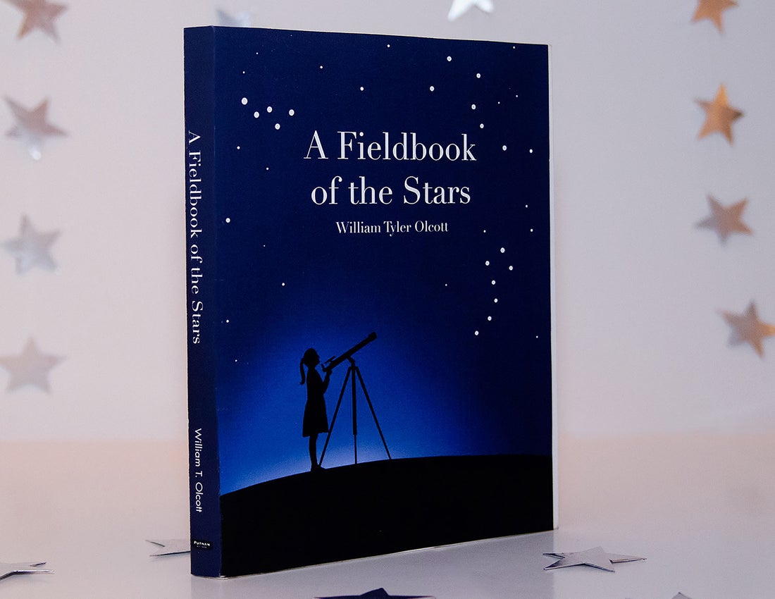
Book Cover and Spread Design
Objective
Design a 5-page spread and cover with spine using an open-source text.
Description
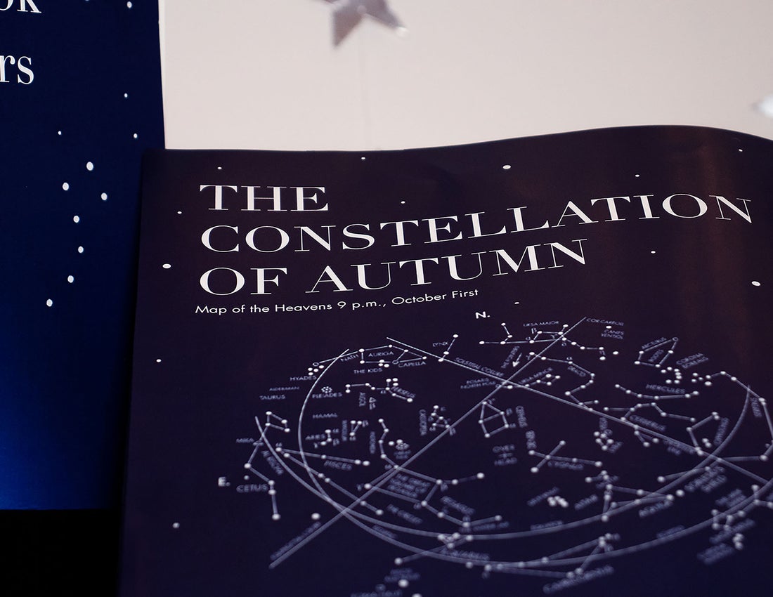
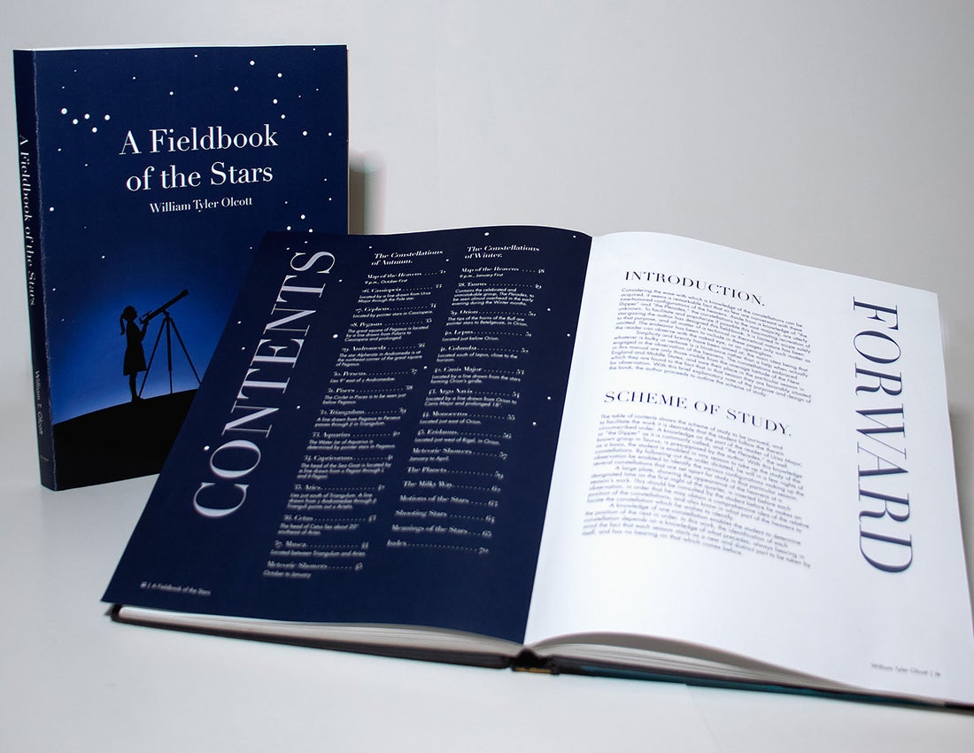
The chosen book, A Fieldbook of the Stars by William Tyler Olcott was originally published in 1907 but became public domain in 2007. The text intends to assist the reader in locating stars and constellations using written guides and a diagram. The images attached to the original document were low resolution and hard to understand. The first step in the new design was to redraw the illustrations to simplify and increase the quality. I traced the original illustrations so the images remained accurate to the original. The dark blue colour used throughout the book is calming and reminiscent of the night sky. It is dark enough that text can be reversed and easily readable. On each spread, only the left page is dark with the right page being white so the spread is not overwhelmingly dark. The blue is still used on the white page through the stars and headers. The cover features a young girl using a telescope with some more common constellations sprinkled in the stars. The small circles are consistent through the spreads and on the cover as stars sprinkled through the book.
I would like to eventually design the entire book and have it printed for my own enjoyment. Stargazing and finding constellations is one of my hobbies so being able to utilize one of my designs for that would be incredible!
Grad Show Exhibition Poster
Objective
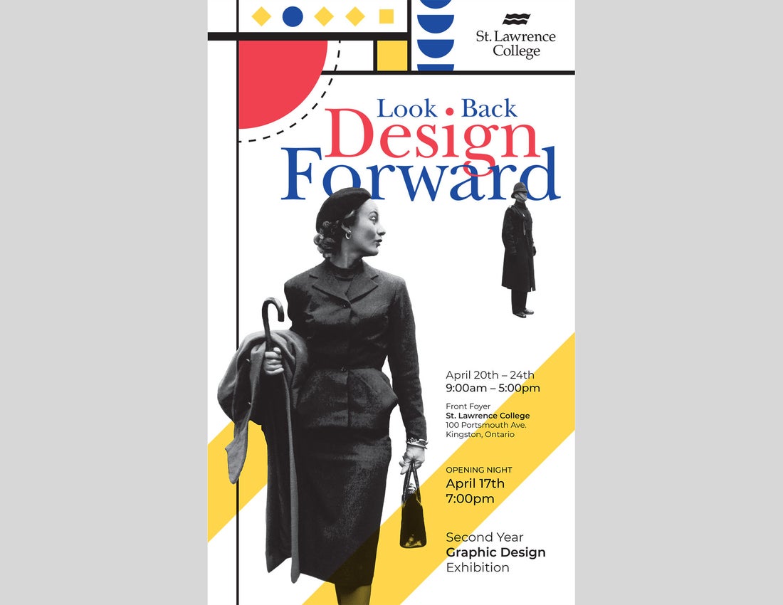
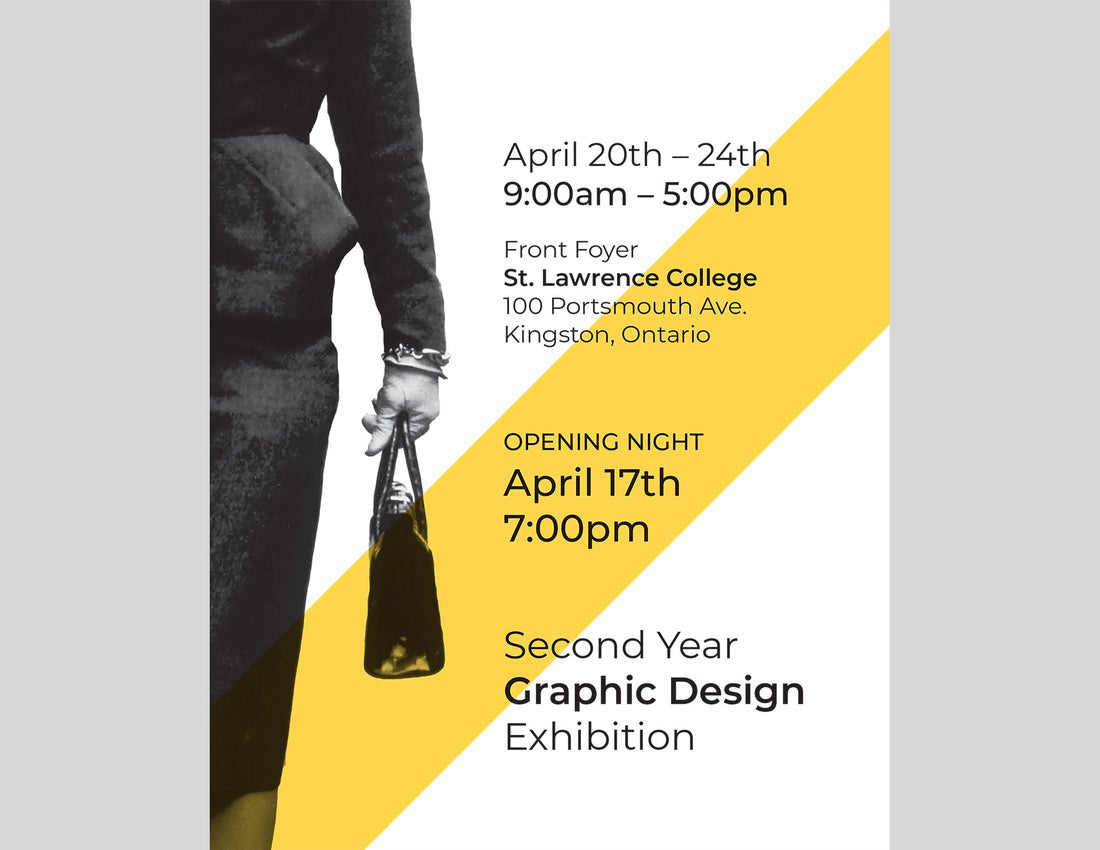
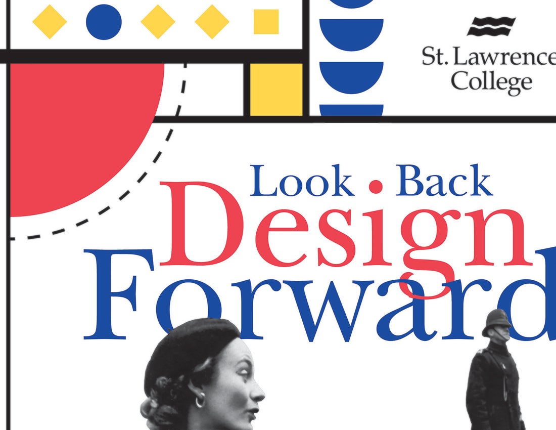
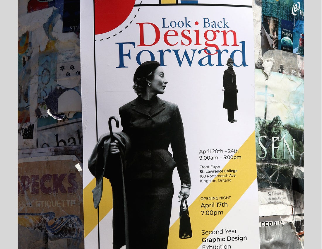
Design a poster to promote the second-year Graphic Design Exhibition using the tagline “Look Back, Design Forward”.
Description
The design of this poster started with considering what has already been done and how it can be improved upon. Using the Bauhaus style, I dove into research of the design style and discovered how influential it was! Bauhaus has impacted every area of design from architecture, to interior design, and of course, graphic design. The fundamentals included simple colour schemes, balanced asymmetry, and functional shapes. The blue, red, yellow combination is eye-catching and draws in the next generation of designers who are currently graduating high school or thinking about post-secondary education. The imagery used is licensed under Creative Commons from the Library of Congress. The image is a great visual representation of look back, design forward as she is looking back while walking forward. The image also has a bit of comic relief as she is “checking out” the guard who is completely unaware. The difference in size creates a sense of dimension that is exaggerated by the image overlapping the graphic elements and title text. The yellow lines near the bottom help to connect the woman to the rest of the image as the eye follows the yellow up to the rest of the image.
I would like to use this concept for something else as the second-year exhibition was cancelled. I would rework some of the graphic elements and possibly add some more hand-drawn pieces into the design.
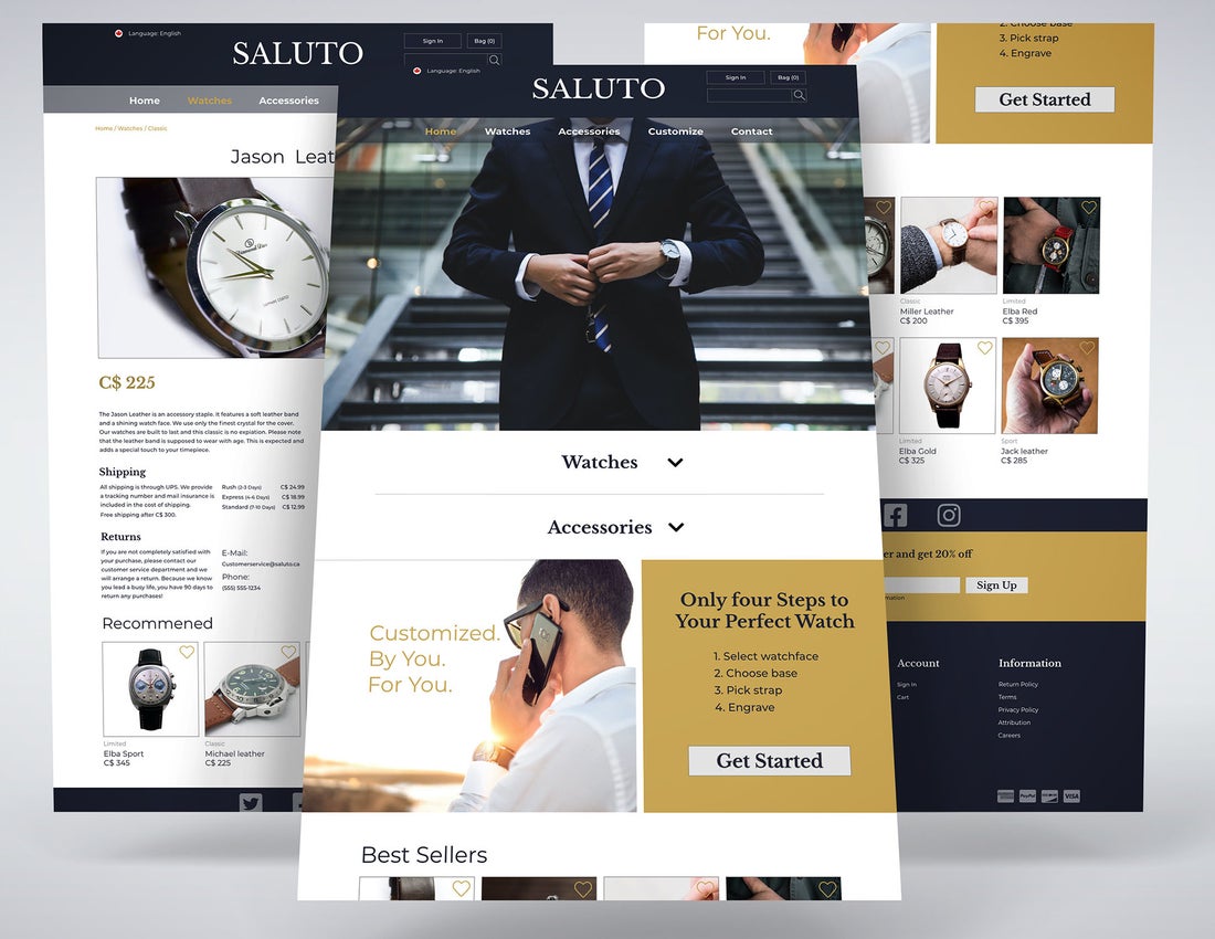
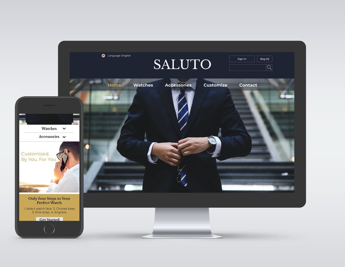
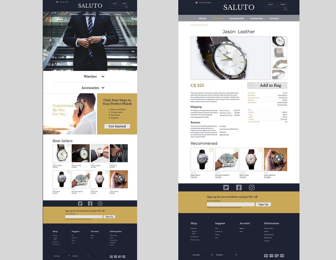
E-Commerce Website
Objective
Design a homepage and product page for a new E-commerce website.
Description
Saluto is a men’s watch and accessories online retailer focused on today’s businessman. The website needed to be simple and straightforward. The customer for this company wants to get straight to the point when shopping and doesn’t want to be constantly shown sales or promotions. The colours used throughout the website are professional and sophisticated. The first thing the shopper would see is the header with all available pages clearly listed. The hero image will resonate with the audience as they would want to emulate the image. Next, is another spot that the customer can start shopping. The next section is the customizable option. This is to show the customer that there is a customizable watch option which is a very popular option that many companies have started doing. Next, are some bestsellers to inspire someone who is browsing or doesn’t know where to start on their watch journey. Finally, the footer includes standard footer features such as email list prompt, social media icons, and the site map. The product page is information oriented so the customer can quickly see all information they would need.