Designer Bio

My name is Brenda Orozco, I am 23 years old and I am originally from Mexico. Currently, I am living in Canada, studying my last year of the Graphic Design program at St. Lawrence College in the city of Kingston, Ontario.
I grew up in a very artistic environment when I was a kid, my mom was a talented graphic designer in Mexico and due to that, I was always intrigued to know more about music, art and design. I chose graphic design as a career since I realized the beauty that this program content. I consider graphic design is the best way to bring my ideas to life and express messages making use of creative skills. I am very passionate about creating digital contains related to design, music and motion graphics. I am very dedicated, well organized and very curious about learning new things.
I have 3+ years of experience in the field of design and my professional goals are to keep improving my creative skills in order to find a professional job in this field.
email: brenda.orozco.p@gmail.com
Web: https://brendaorozcop.myportfolio.com
instagram: b.o.p_design
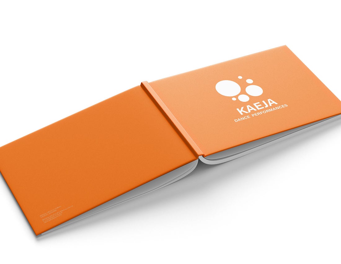
Rebranding and Adaptations
Objective
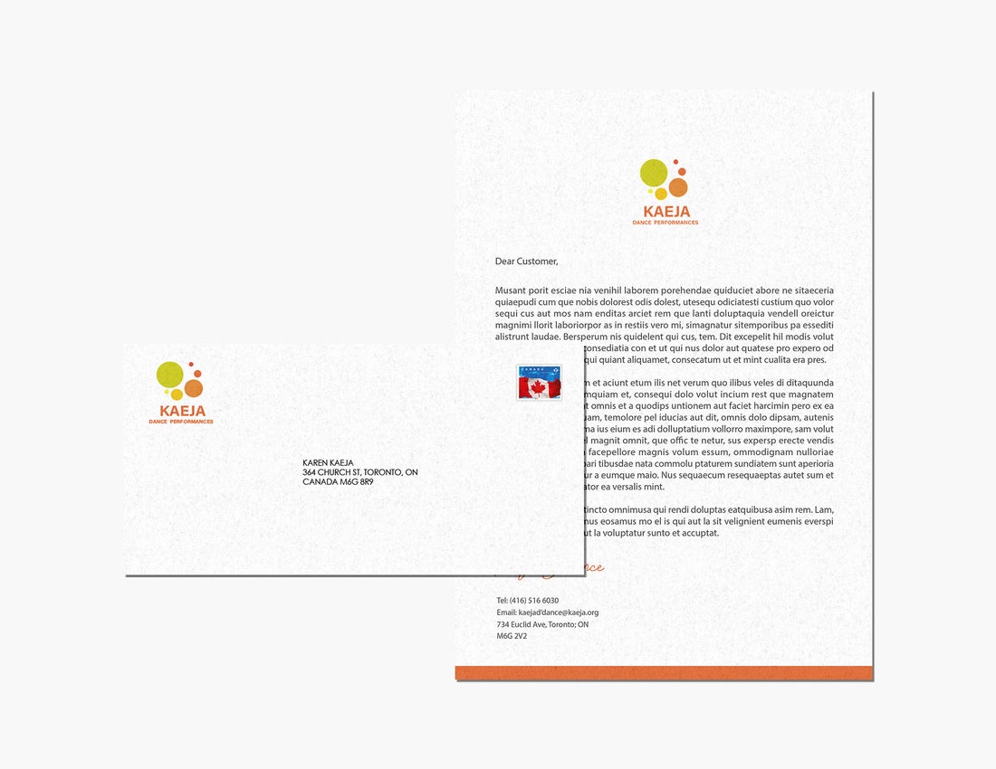
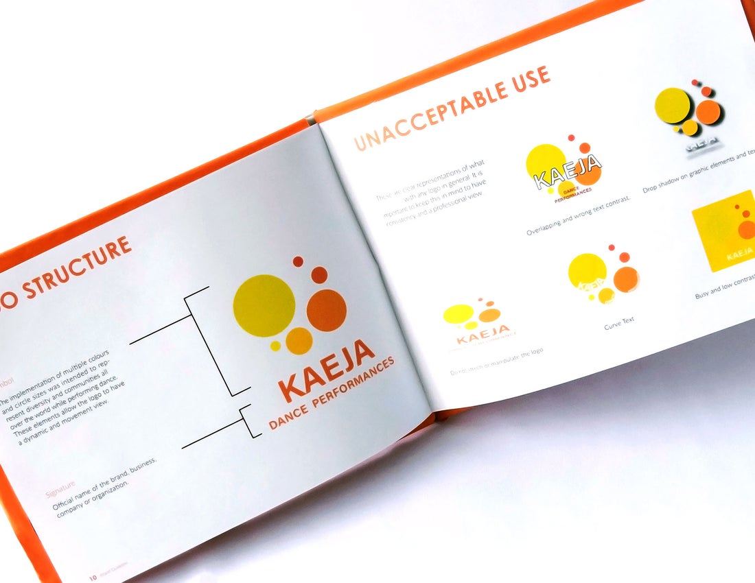
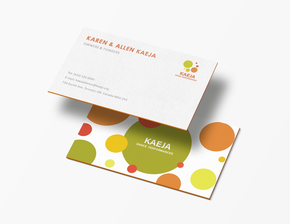
The objective of this project was to redesign an existent logo and create a branding identity for a non-profit organization. The organization that I chose for this project is called Kaeja d’Dance and is dance performances organization located in the city of Toronto.
Description
By working with this organization I improved their existent logo by implementing new elements to make it more simple and attractive for the audience. For this redesign, I implemented multiple visual elements such as circles to give a view of movement and represent dance communities. For this project was required to create a brand guide explaining the reason of the branding elements previously chosen such as colour scheme, typography and imagery. For this project, it was essential to develop multiple brand identity applications such as business cards, letterheads, envelopes and promotional merchandise. The primary colour implemented in the brand guide is orange since it follows with the logo scheme.
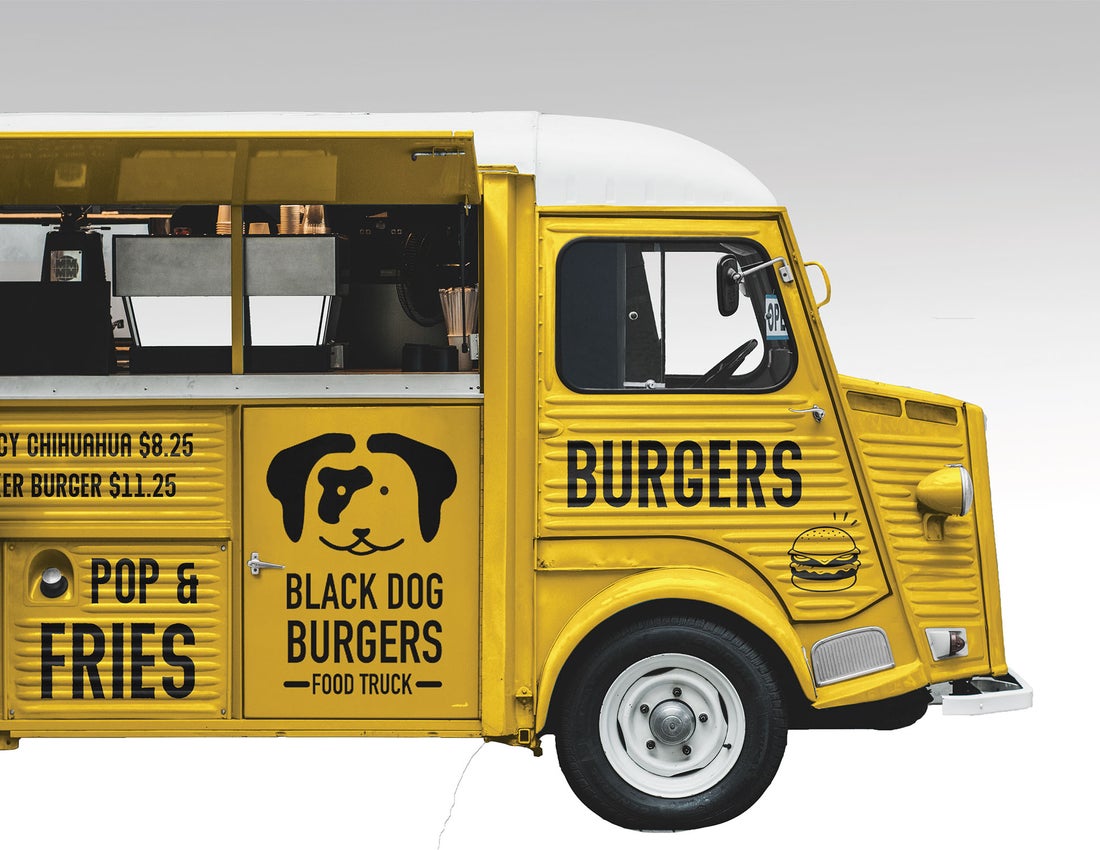
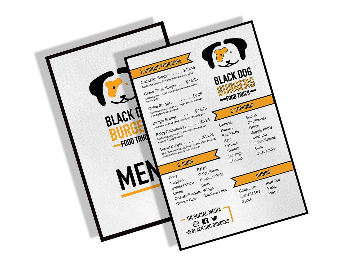
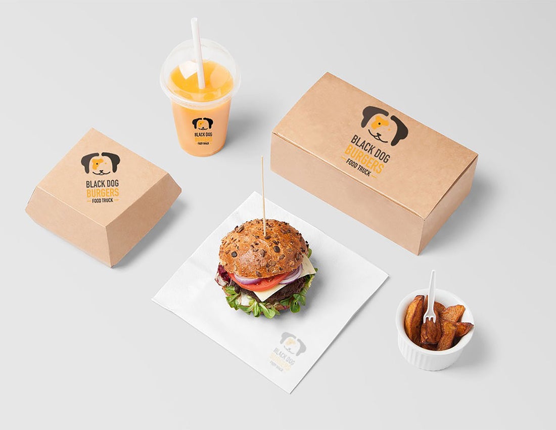
Logo and Menu Creation
Objective
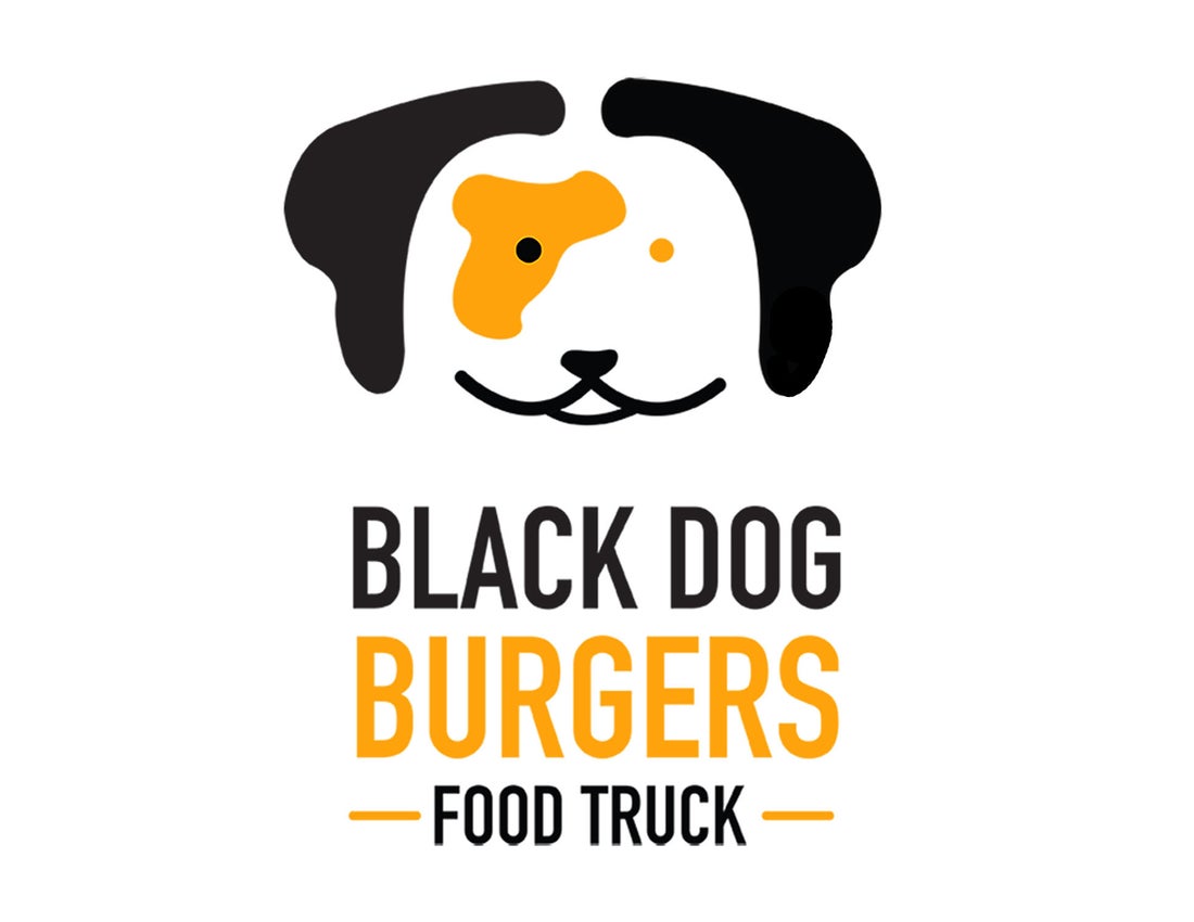
The objective of this project was to create a logo identity and a menu for a non-existent business in the city of Kingston. This brand was intended to be used for a food truck business specialized in burgers and street food. The target audience for this market are locals, tourists, people who were in a rush on their way to work and low income people such as students.
Description
For this project, was required to elaborate a logo that represented the essence of the business name, the values and the product of the business. The concept of this logo was based on a visual representation of a dog by following the name of the business as a wordmark. This logo was intended to give a feeling of fast food by creating an effective design solution to be attractive and appealing for the consumers. Once having the logo identity developed, was essential to create a menu that represented the essence of the business and inform the consumers about the multiple food options and prices. The spread of this menu was developed to be a folded menu with the sizes of 7 x12” printed in CMYK.
The colour scheme gives an attractive view by making use of 2 colours black and yellow. The use of DIN Condensed and Kannada Sangam MN typefaces effectively achieves a clear and a modern look for all the consumers.
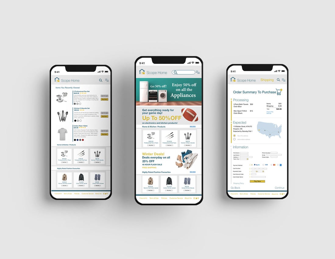
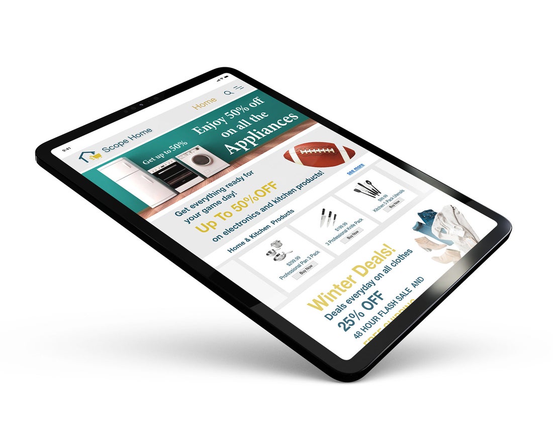
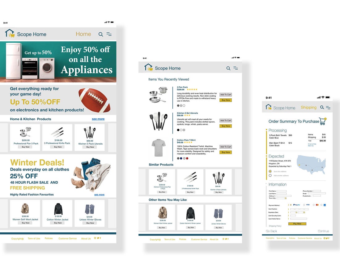
E-Commerce Website
Objective
The objective of this project was to create a responsive e-commerce site in order to adapt it into 3 different breakpoints such as desktop, mobile phone and Ipad.
Description
For this project was required to create an effective design for a e-commerce site. I decided to create this site based on a retail store where people would be able to find multiple products such as clothes, housing, outdoors and electronics. The primary target audience ranges from 30 to 50 years old. A large majority of this primary audience are people who own a family, looking for products for their home and family. The goal was to improve the usability with customers and give an appealing view of the products on multiple platforms. When developing this design the typography helped me to organize information on different sections depending on their relevance. The implemented typefaces were Helvetica Neue and Minion Pro. It was essential to follow with the web-safe fonts using the appropriate sizes and weights to achieve good visibility and provide accessible content for customers.